Langara Construction
Langara Construction
Langara Construction
Langara Construction
Client
Langara Construction
Edenshaw
Discipline
Corporate
Location
Mississauga, Ontario
Langara Construction is a building practice specializing in design-driven and architecture-led residential construction projects. Located in the Greater Toronto Area, Langara Construction works alongside teams of award-winning architects, interior designers, landscape architects, and property developers to realize innovative structures that aim to propel the future of city building. With a distinct drive to produce buildings of enduring quality, Langara Construction meticulously oversees each project from conception to completion.
Vanderbrand developed a new visual identity that would establish Langara Construction as a leading authority in residential and multi-residential construction. Led by a striking graphic symbol, the resulting brand is designed around a contemporary framework that reflects the internal structures and processes of building. Grounded by the weight of the logo mark and supported by captivating photography, Langara Construction’s new visual presence allows for compositional flexibility across a wide range of brand applications.
Langara Construction is a building practice specializing in design-driven and architecture-led residential construction projects. Located in the Greater Toronto Area, Langara Construction works alongside teams of award-winning architects, interior designers, landscape architects, and property developers to realize innovative structures that aim to propel the future of city building. With a distinct drive to fabricate buildings of enduring quality, Langara Construction meticulously oversees each project from conception to completion.
Vanderbrand developed a new visual identity that would establish Langara Construction as a leading authority in residential and multi-residential construction. Led by a striking graphic symbol, the resulting brand is designed around a contemporary framework that reflects the internal structures and processes of building. Grounded by the weight of the logo mark and supported by captivating photography, Langara Construction’s new visual presence allows for compositional flexibility across a wide range of brand applications.

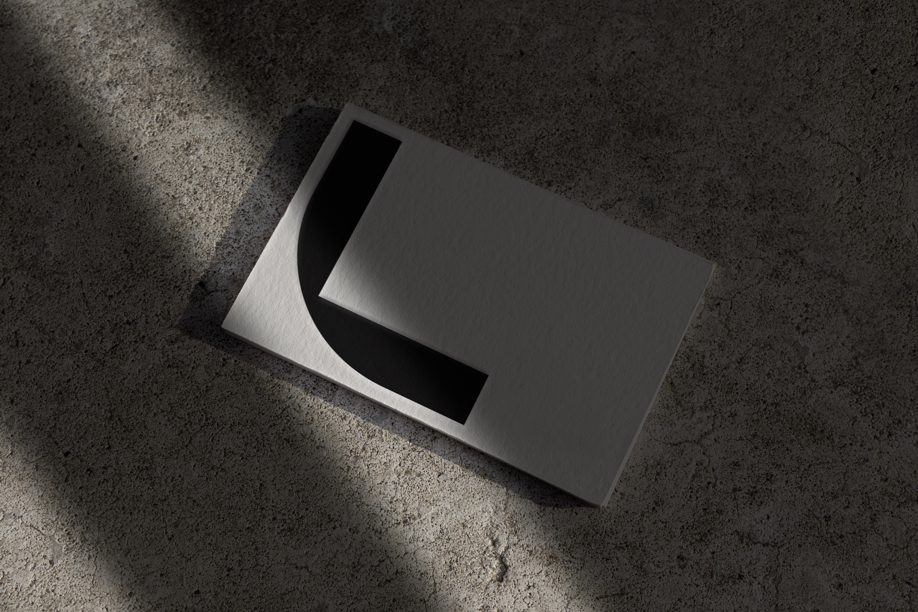
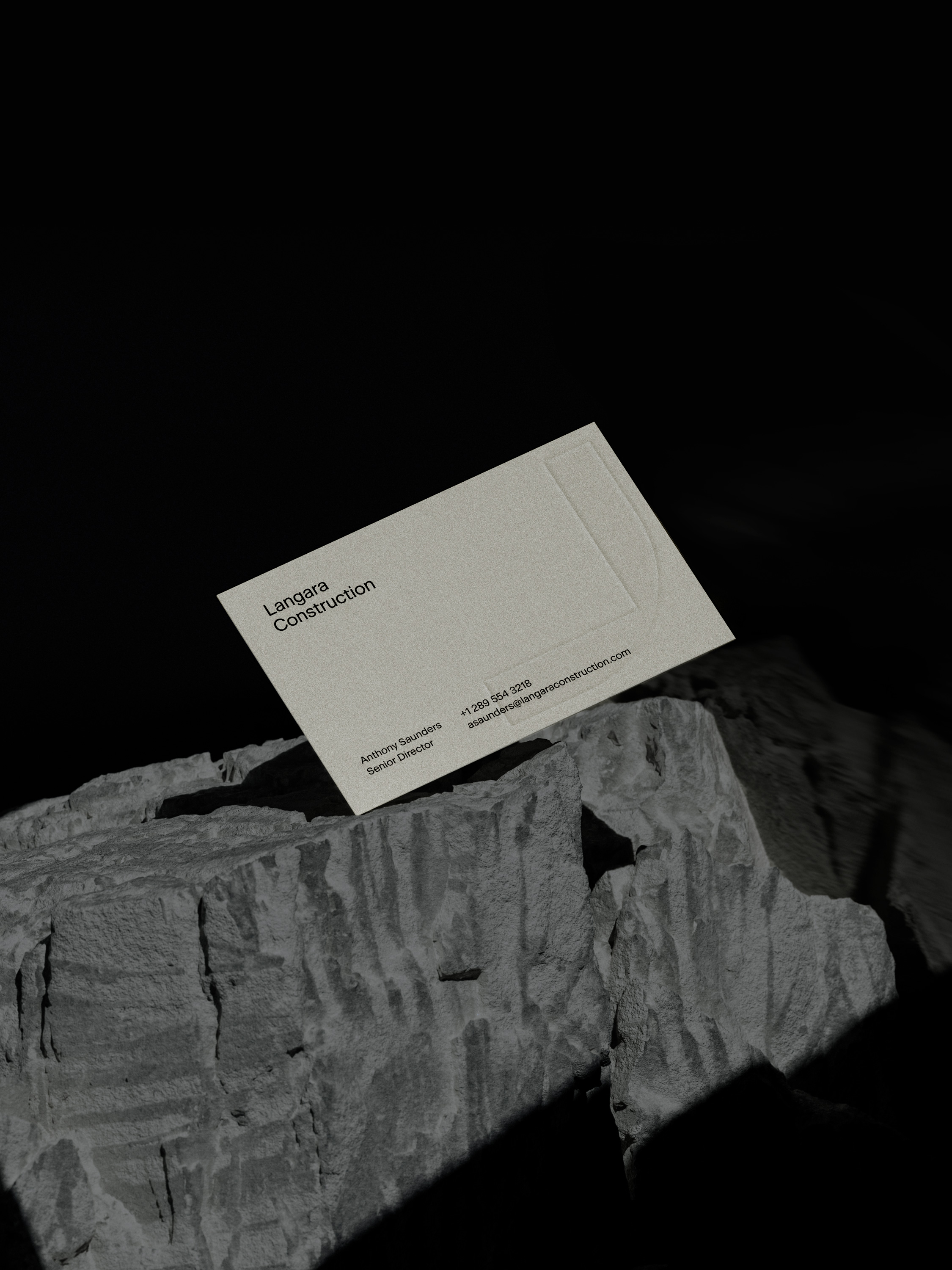
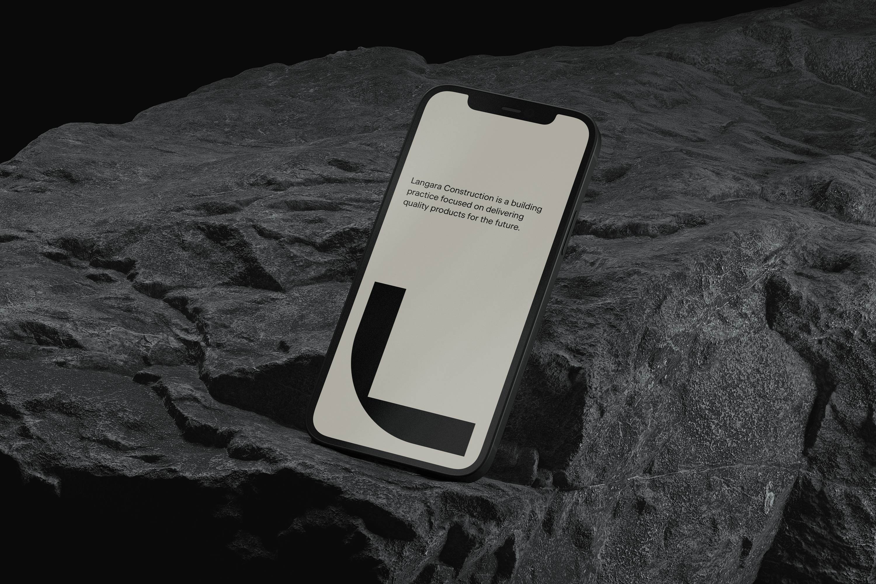
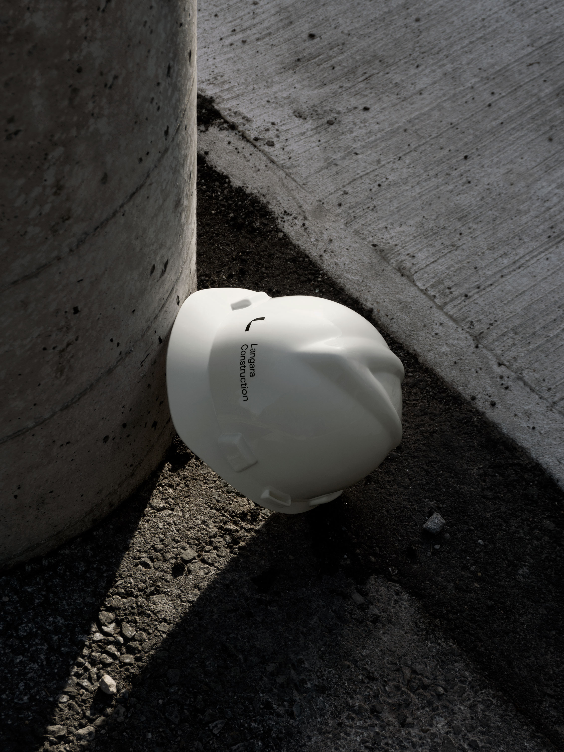
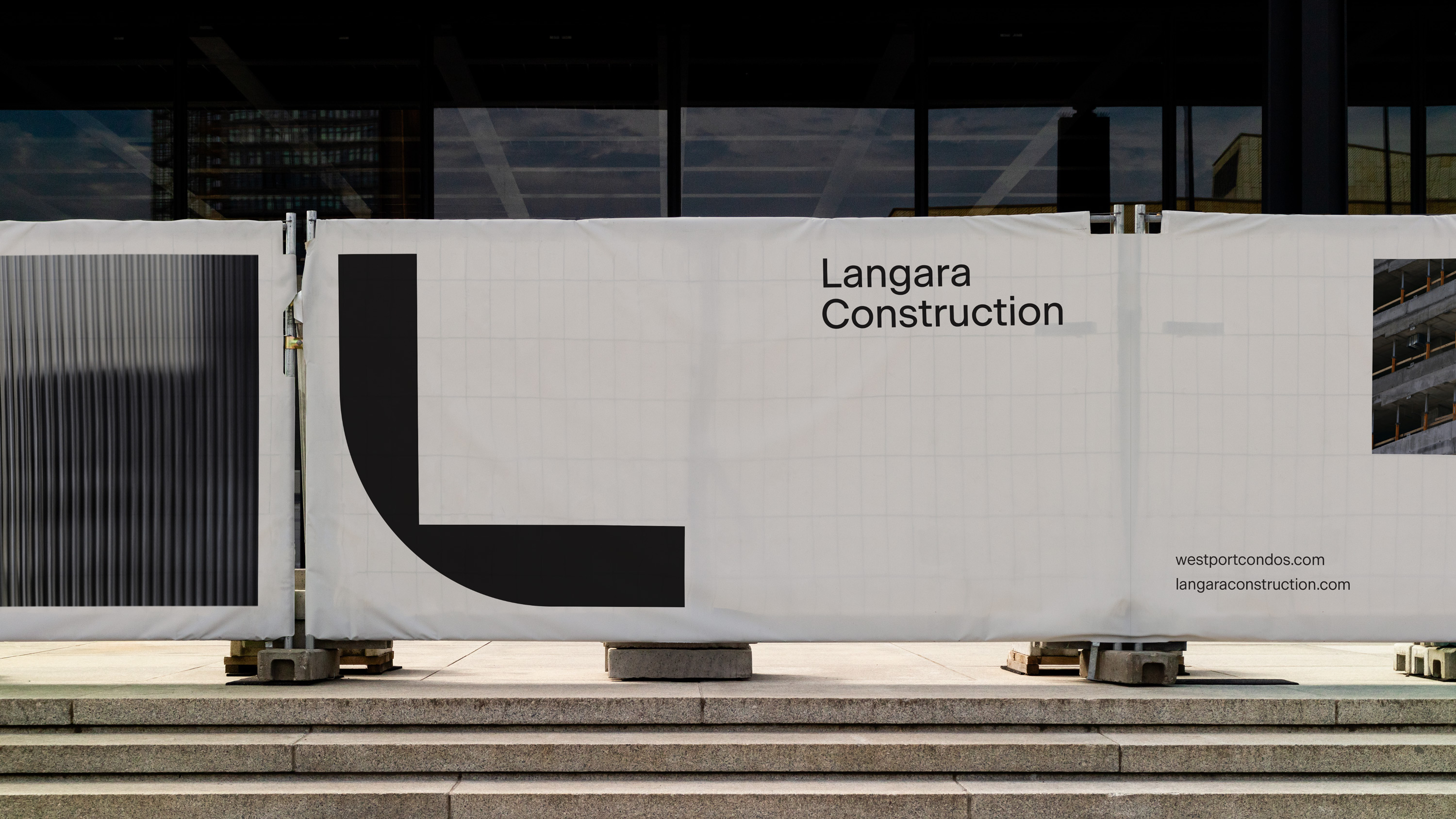
Drawn with reference to geometry and architecture, the logo mark utilizes overlapping primary shapes to construct an abstracted graphic monogram that captures both the angular edges and round curves of Langara Construction’s initials. The resulting symbol is an iconic emblem that feels organic yet constructed. The monolithic form is balanced by a light-weight sans-serif word mark; pulling apart from each other to anchor the visual space within each composition they occupy.
Drawn with reference to geometry and architecture, the logo mark utilizes overlapping primary shapes to construct an abstracted graphic monogram that captures both the angular edges and round curves of Langara Construction’s initials. The resulting symbol is an iconic emblem that feels organic yet constructed. The monolithic form is balanced by a light-weight sans-serif word mark; pulling apart from each other to anchor the visual space within each composition they occupy.
Drawn with reference to geometry and architecture, the logo mark utilizes overlapping primary shapes to construct an abstracted graphic monogram that captures both the angular edges and round curves of Langara Construction’s initials. The resulting symbol is an iconic emblem that feels organic yet constructed. The monolithic form is balanced by a light-weight sans-serif word mark; pulling apart from each other to anchor the visual space within each composition they occupy.
Drawn with reference to geometry and architecture, the logo mark utilizes overlapping primary shapes to construct an abstracted graphic monogram that captures both the angular edges and round curves of Langara Construction’s initials. The resulting symbol is an iconic emblem that feels organic yet constructed. The monolithic form is balanced by a light-weight sans-serif word mark; pulling apart from each other to anchor the visual space within each composition they occupy.
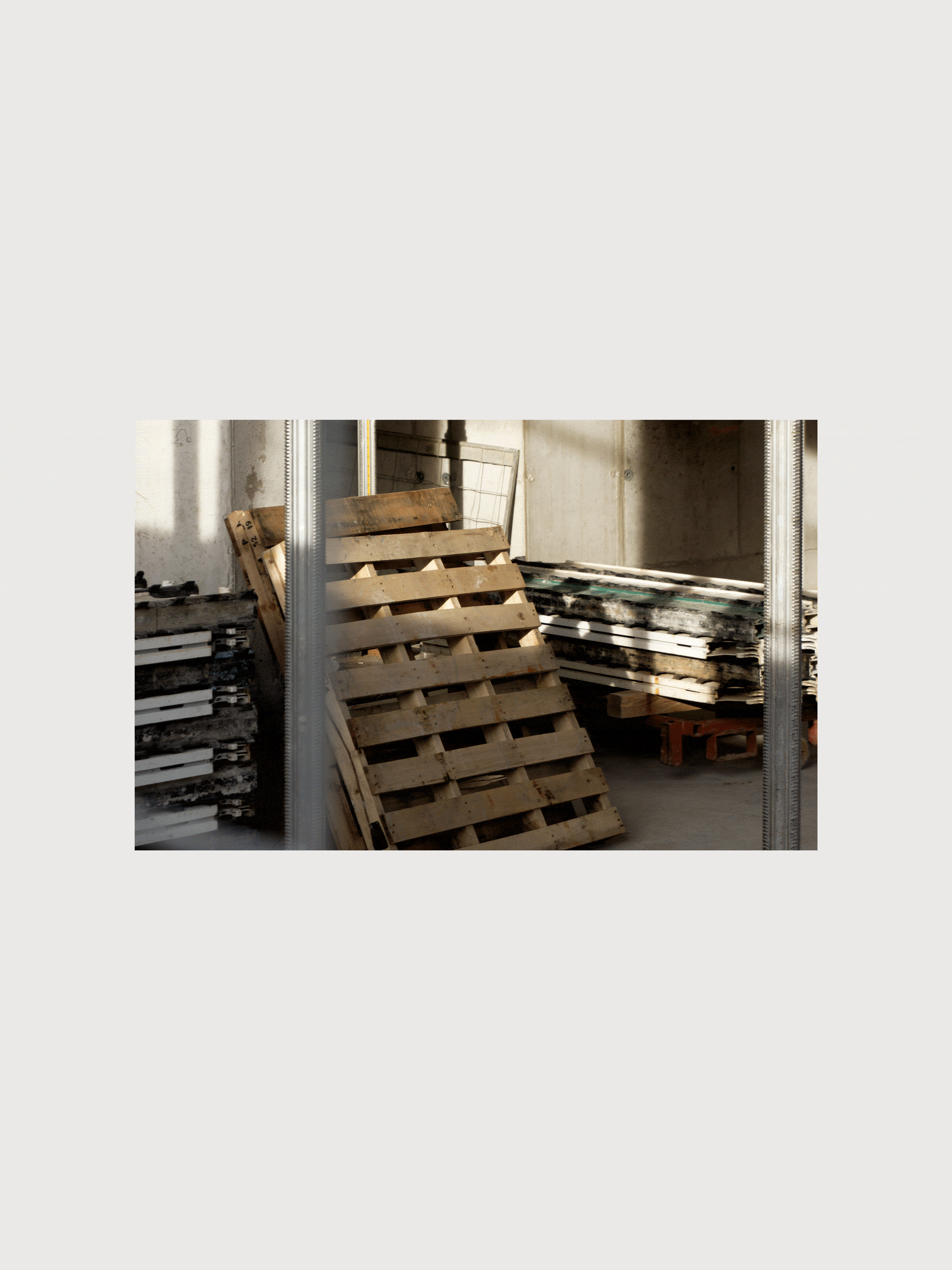
Langara Construction is dedicated to establishing a legacy of quality, longevity, and innovation within the residential building community. Through photography, the construction practice is able to visually communicate the attention-to-detail, high-quality materials, and building processes that set them apart from competitors. In addition to documenting each project through its numerous phases, the imagery allows for a level of transparency and trust to be established between Langara Construction and those who will eventually occupy the structures they build.

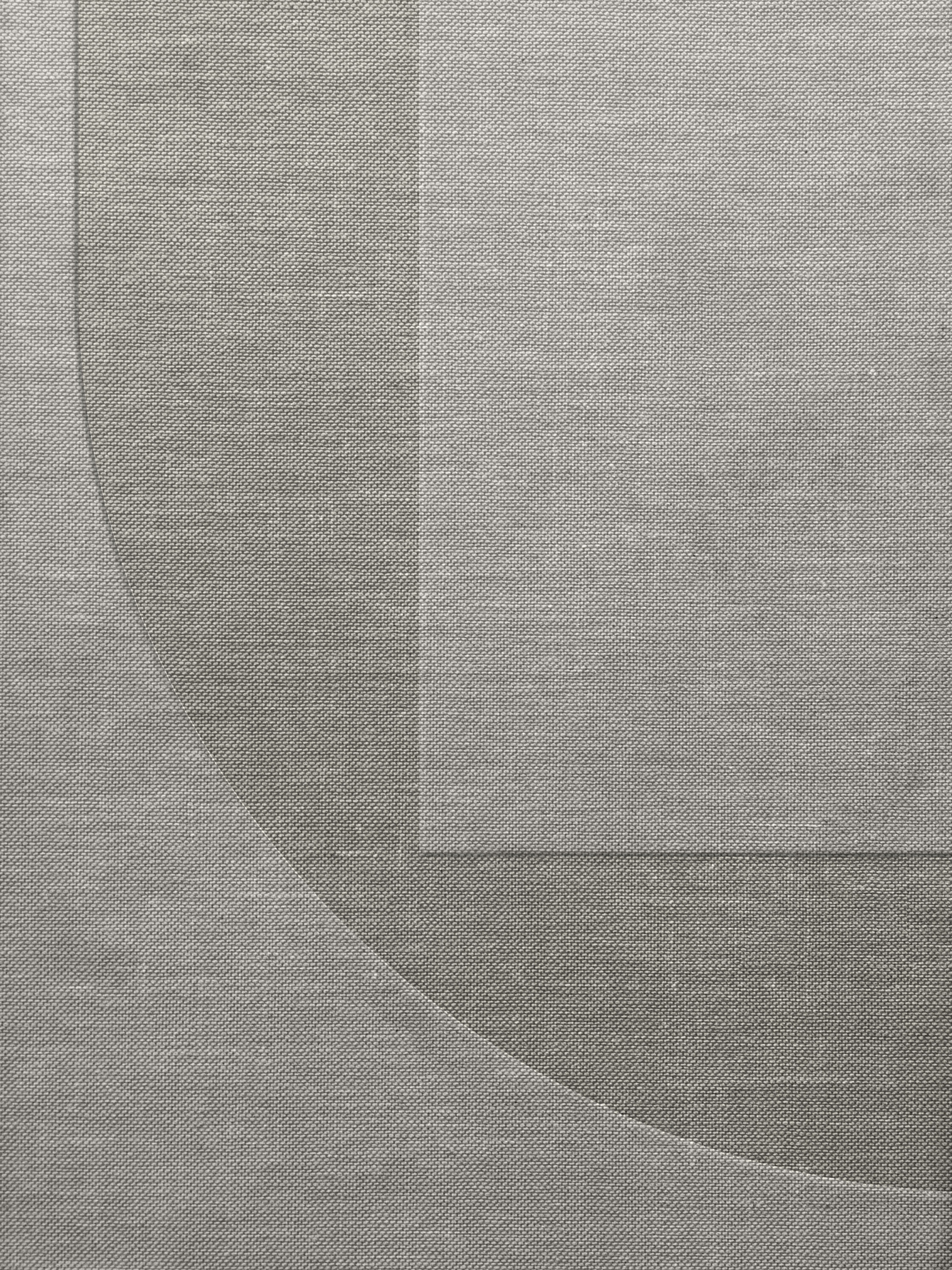

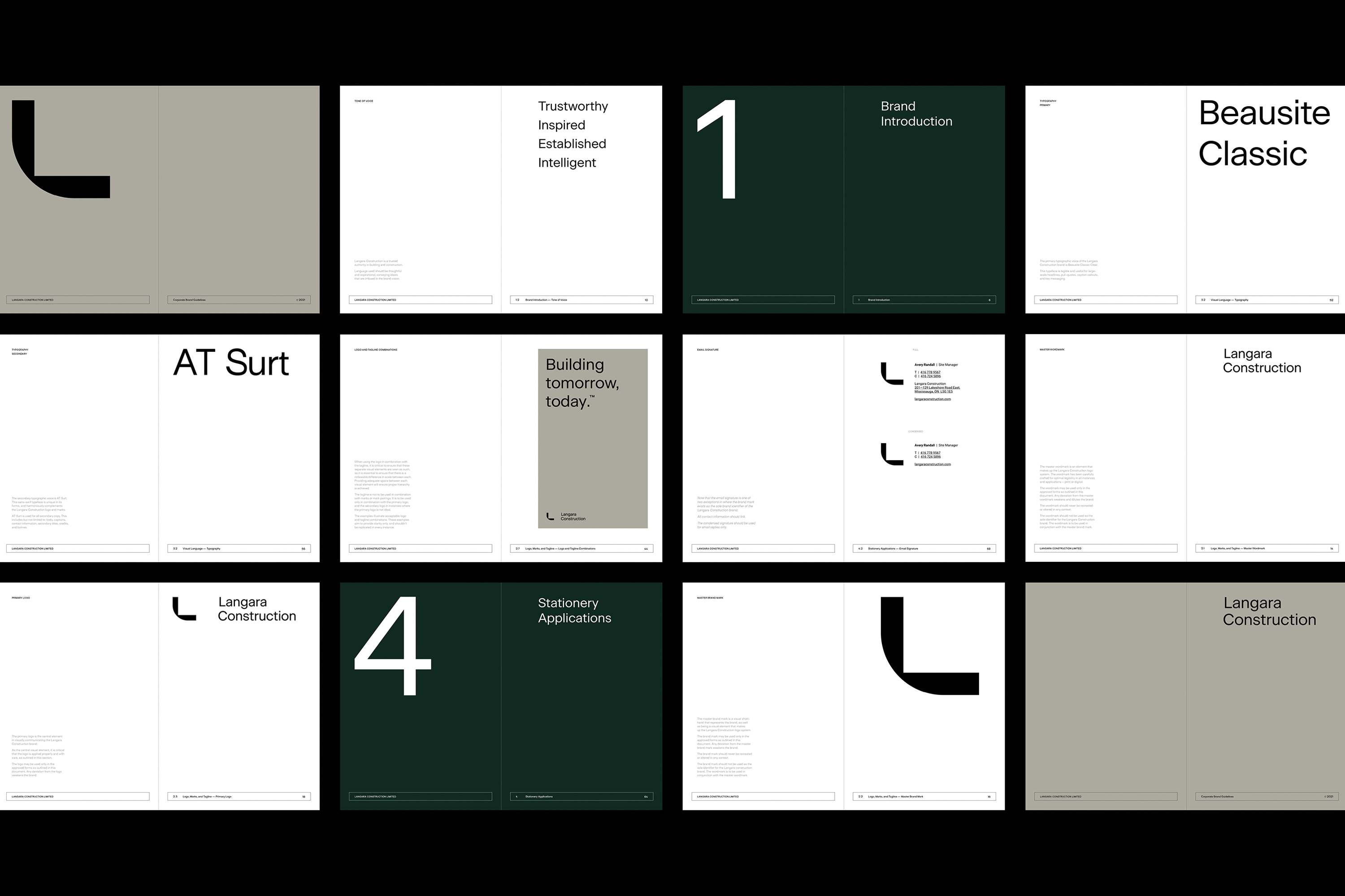
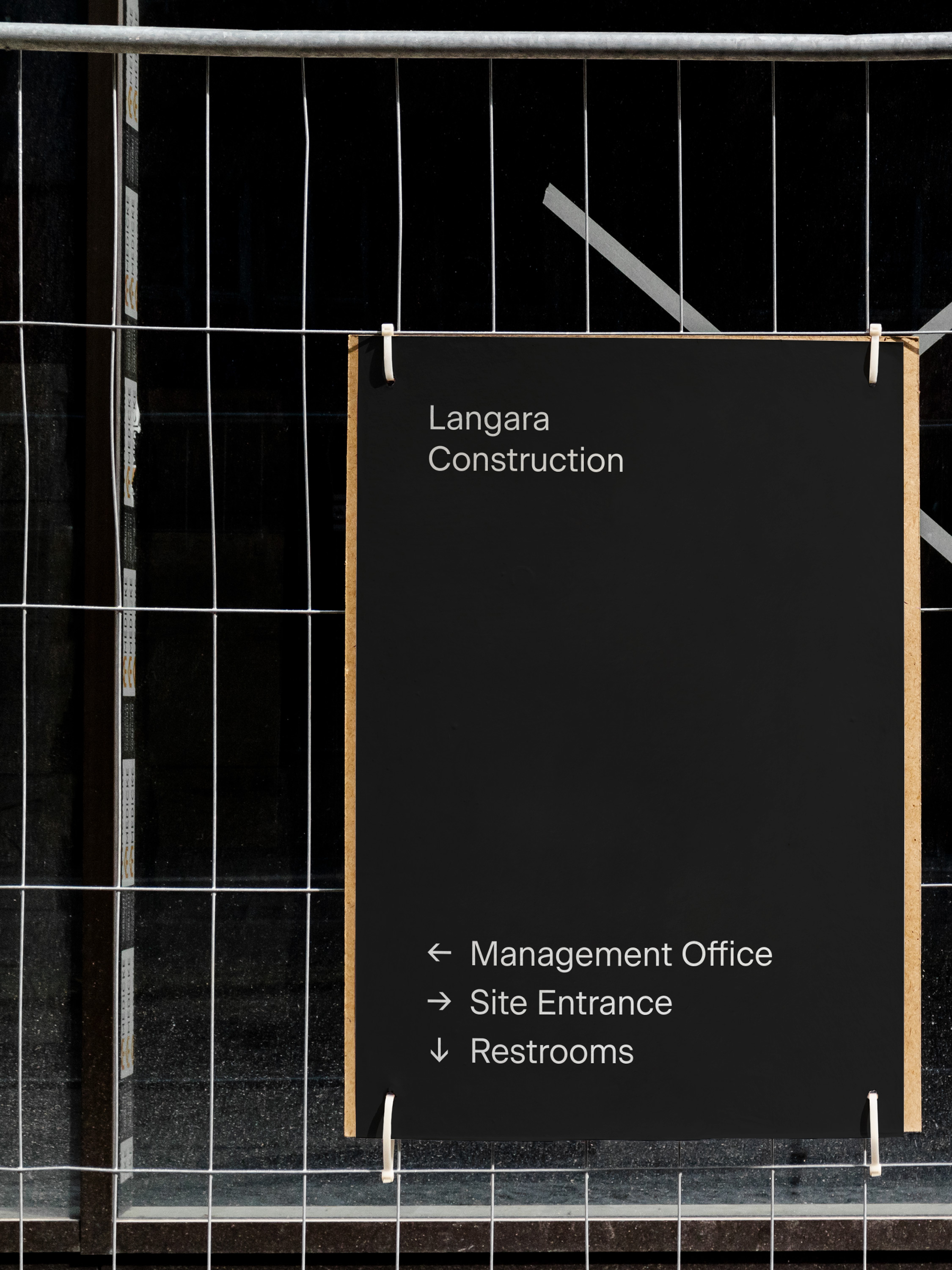
With a colour palette derived from the natural tones and fabricated textures of building materials, the monochromatic scheme is enhanced by the use of a deep forest green. Paired with unobtrusive typography, this neutral foundation works to support any number of distinct architectural projects, now and into the future. A secondary graphic language is used as a visual architecture to enclose and organize key information. Referencing the internal framework of buildings, these flexible containers stretch or shrink to accommodate different types of content.
With a colour palette derived from the natural tones and fabricated textures of building materials, the monochromatic scheme is enhanced by the use of a deep forest green. Paired with unobtrusive typography, this neutral foundation works to support any number of distinct architectural projects, now and into the future. A secondary graphic language is used as a visual architecture to enclose and organize key information. Referencing the internal framework of buildings, these flexible containers stretch or shrink to accommodate different types of content.
With a colour palette derived from the natural tones and fabricated textures of building materials, the monochromatic scheme is enhanced by the use of a deep forest green. Paired with unobtrusive typography, this neutral foundation works to support any number of distinct architectural projects, now and into the future. A secondary graphic language is used as a visual architecture to enclose and organize key information. Referencing the internal framework of buildings, these flexible containers stretch or shrink to accommodate different types of content.

Awards
2022 Advertising and Design Club of Canada
Silver Award
Stationery
2022 Advertising and Design Club of Canada
Bronze Award
Logo
2022 Advertising and Design Club of Canada
Bronze Award
Brand Identity
2022 Advertising and Design Club of Canada
Bronze Award
Complete Design Program
2022 Communication Arts Design Competition
Award of Excellence
Integrated Branding Program
2022 Communication Arts Design Competition
Shortlist
Trademark
More Work
Boutique residences where everything comes together
Boutique residences where everything comes together
Boutique residences where everything comes together
Unifying Toronto’s urbanity with the tranquility of its ravines
Unifying Toronto’s urbanity with the tranquility of its ravines
Unifying Toronto’s urbanity with the tranquility of its ravines
Bringing clarity to contemporary architecture
Bringing clarity to contemporary architecture
Bringing clarity to contemporary architecture